Graph: Northern Hemisphere Extent Anomalies Oct 1979-2017
by National Snow and Ice Data Center
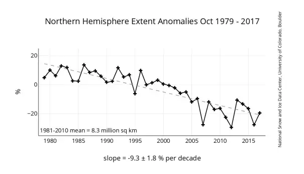
This graph shows monthly ice extent anomalies plotted as a time series of percent difference between the extent for the month in question and the mean for that month based on the January 1981 to December 2010 data. The anomaly data points are plotted as plus signs and the trend line is plotted with a dashed grey line.