Map: Observed US Temperature Changes, 1991 - 2012
by National Climate Assessment / NOAA NCDC / CICS-NC
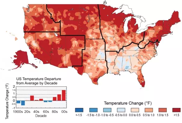
The colors on the map show temperature changes over the past 22 years (1991-2012) compared to the 1901-1960 average for the contiguous U.S., and to the 1951-1980 average for Alaska and Hawai'i. The bars on the graph show the average temperature changes by decade for 1901-2012 (relative to the 1901-1960 average). The far right bar (2000s decade) includes 2011 and 2012. The period from 2001 to 2012 was warmer than any previous decade in every region.