Chart: El Niño, La Niña, and Rising Global Temperature
by Richard Middleton on Twitter
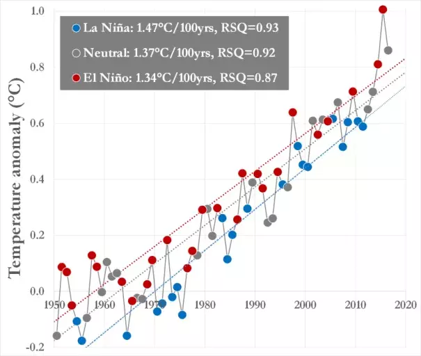
The world has been rapidly warming, at a rate of 1.4°C per 100 years, since 1950 according to NOAA data. The chart illustrates this warming for El Niño years (red), La Niña years (blue), and ENSO-neutral years (grey) (ENSO is the El Niño–Southern Oscillation). This warming trend (dotted lines) is significant regardless of the ENSO signal. Further, there is very little overlap between the ENSO years and trends. For example, since 1950, no La Niña years (blue circles) were warmer than the El Niño trend (red dotted line), and only one El Niño year (red circles; 1976–1977) was cooler than the La Niña trend (blue dotted line).