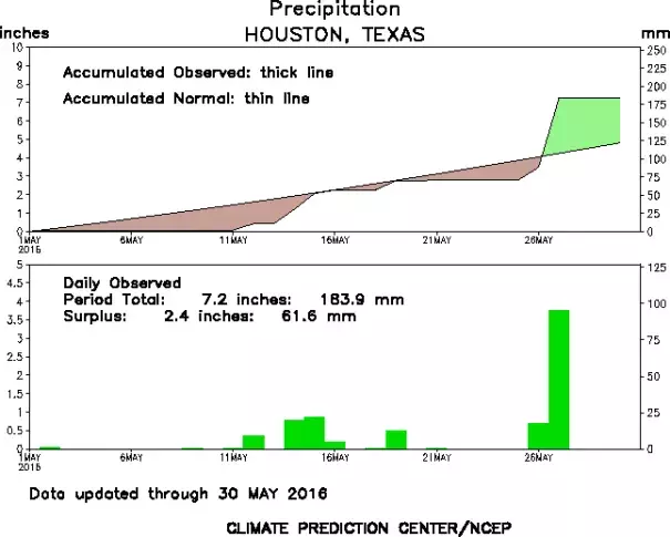
In the time series, the thick line depicts the accumulated actual precipitation and the dashed, thin line shows the accumulated normal precipitation. Regions shaded green show precipitation surpluses; regions shaded brown show precipitation deficits.