Map and Chart: 2015 Extremely Warm Days
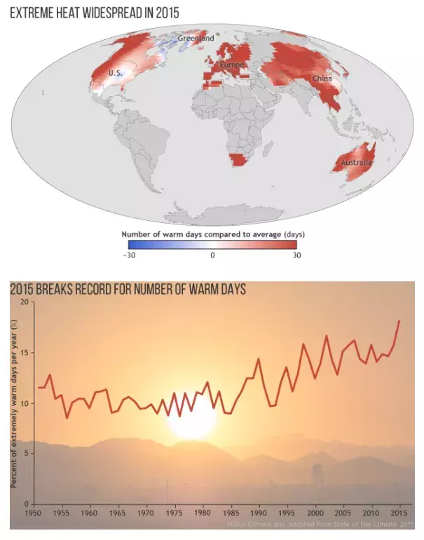
The year 2015 broke the record for the highest number of extremely warm days in the 66-year record (1.8 times more than the average number according to one dataset).
The map shows the frequency of warm days in 2015 compared to the long-term (1961-1990) average. For this analysis, days with temperatures warmer than 90 percent of the 1961-1990 seasonal record are considered “extremely warm days.” The areas shaded red had a higher-than-average number of extremely warm days in 2015.
The few areas shaded blue—southern Greenland and the eastern United States—had fewer extremely warm days than average. In the eastern United States, this might have been due to the lingering influence of the cold 2014/15 winter.
Below the map, the graph shows the percent of days each year—from 1950 to 2015—that were extremely warm. Although the percent of hot days rises and falls from year to year due to natural variability, the overall global trend is clear: the number of hot days has increased.