Map and Chart: Ocean heat storage 2015
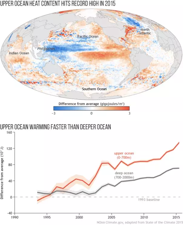
The map, created from in situ ocean temperature and sea level data from satellites, shows heat energy in the top 2,300 feet (700 meters, or slightly less than half a mile) of the ocean in 2015 relative to a 1993-2015 average. Areas in blue show ocean where stored heat was below average, while areas in orange and red show where ocean heat content was above average.
Upper ocean heat shifted from the western equatorial Pacific toward the central Pacific in 2015, leaving a large pool of water near the Philippines with much-lower-than-average heat content. Meanwhile, heat energy was above average across the rest of the equatorial oceans. These shifts are consistent with the warm phase of a natural climate pattern in the tropical Pacific Ocean and atmosphere known as El Niño.
A similar contrast shows up in the North Pacific: warm off the west coast of North America but cooler to the west. These contrasting temperatures reflect a transitioning Pacific decadal oscillation. The map also shows a large cool patch in the North Atlantic, which might be linked to a weakened Atlantic meridional overturning circulation.
The graph beneath the map shows heat content in the upper 2,300 feet (700 meters) of the ocean (orange) and the deeper ocean (2,300–6,500 feet, gray) relative to a 1993 baseline. Heat energy rises and falls every few years in response to natural patterns like El Niño and La Niña, but those ups and downs are superimposed on a long-term increase.
The orange line is steeper than the gray line, which means heat energy is building up faster in the upper ocean than in the deeper ocean. That pattern is what you’d expect to see as a result of atmospheric heating from greenhouse gases. This graph is simplified from the original State of the Climate report graphic, which included multiple analyses for each ocean layer. All analyses show large increases in ocean heat energy since 1993.