Map: Observed precipitation changes in New Orleans, LA
by National Climate Assessment
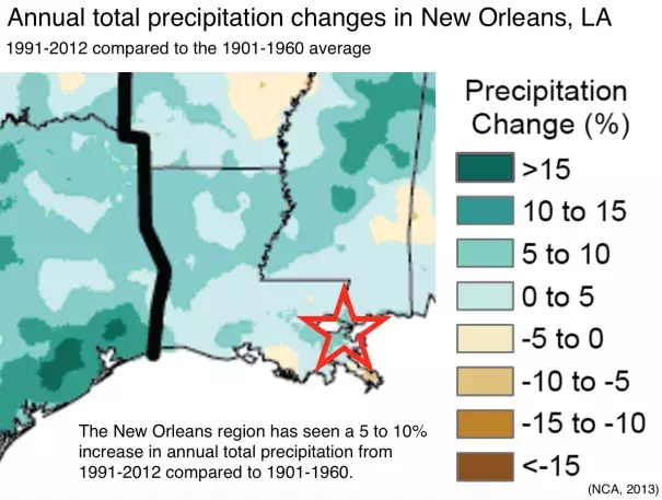
The colors on the map show annual total precipitation changes for 1991-2012 compared to the 1901-1960 average, and show wetter conditions in most areas. The bars on the graphs show average precipitation differences by decade for 1901-2012 (relative to the 1901-1960 average) for each region. The far right bar in each graph is for 2001-2012. Data: Peterson et al. 2013[1]