Maps: Increase in median area burned for western United States ecoprovinces
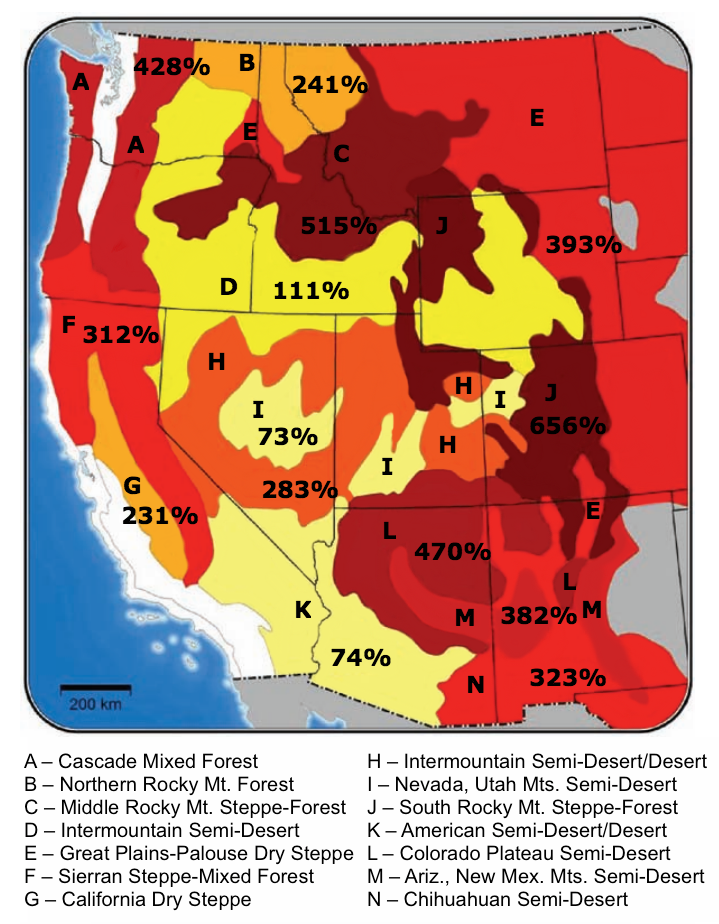

Map of changes in area burned for a 1ºC increase in global average temperature, shown as the percentage change relative to the median annual area burned during 1950-2003. Results are aggregated to ecoprovinces (Bailey, 1995) of the West. Changes in temperature and precipitation were aggregated to the ecoprovince level. Climate-fire models were derived from NCDC climate division records and observed area burned data following methods described in Littell et al. 2009.[1]
Percentage of increase (relative to 1950–2003) in median area burned for western United States ecoprovinces for a 1°C temperature increase. Color intensity is proportional to the magnitude of the projected increase in area burned. Based on Littell et al. 2009.[1]; image available here.
Ecoprovinces of the western United States and common patterns of climate–fire associations from correlation and diagnostic regression models. The 16 ecoprovinces for which Littell et al. provide fire or fire/climate models are labeled. The similar colors group ecoprovinces with similar patterns of climate relationships (northern/mountain ecoprovinces, dry/lower-elevation ecoprovinces, Great Basin and Columbia Basin ecoprovinces, and California ecoprovinces).[1]